

Hi all
Here is an email I sent to Russell
"Russell,
As I said on your blog, I am unable to make it today, stuck here in the
office nstead, but I would like some feedback on the images if possible. I
have three rough's at the moment and will probably switch 2 and three in order.
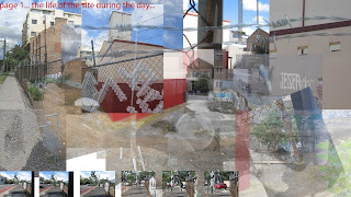
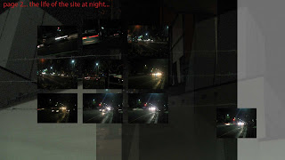
page one and 2 are almost where I want them (minus some text and a few details)
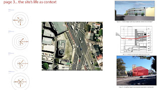
but page 3 at the moment is simply a rough indication of where it is headed, the
idea being that it is the nucleus, the rock that the other two can orbit
around.
A few quick questions too,
1. Are we going to be displaying them simultaniously on three screens or
one at a time?
2. Do the textures need to be embedded in the 3 images, kind of like
popups or rollovers?
3. Will the textures need to able to tile to form seamless surfaces or
can they be standalone?
I would appreciate it if there is any chance of getting feedback by
12ish today so I can look at it and respond before the end of the work day.
Thanks
Noa Tranter"
If anyone has feedback for me I would love it!!
Thanks
4 comments:
Hey Noa,
I'll start by answering your questions
1. Are we going to be displaying them simultaniously on three screens or
one at
a time? Simultaneously, there will be four screens in all, the fourth showing the video of the site that i took just as background ambience
2. Do the textures need to be embedded in the 3 images, kind of like
popups or
rollovers? Check out Flickr, the 'notes' capability that Russell refers to doesn't physically link the textures but the location of textures can be indicated by the notes. The textures themselves are in a 'set'. Sort of like a sub folder which you can use to group them accordingly.
3. Will the textures need to able to tile to form seamless surfaces or
can they
be standalone?
Generally they tile and are 1024x1024 pixels but as Russell told me there may be some sort of aesthetic you are going for where a seamless surface isn't desired. Also i think the UT3 editor has the ability to merge the tiles together to save us the trouble.
I'll get back to you on the feedback for the montages. Need to have a closer look :)
Alrighty some feedback on your montages.
It appears that you are focusing on 'movement' for your series. The walking visitor to the site during the day, the traffic surrounding the site at night and the movement of the wind and even the possible transition of the site as proposed in the rta development.
I think the way you have blended the day image together gives a good indication of theis movement and the more minor elements of the photos along the bottom create the dialogue of movement along the pavement. This contrasts well with the opposite situation of night where the occupant would be stationary at the site and surrounded by traffic, and you've shown that with the extra prominence given to the stationary photo but with movemet of the cars showing. The final image doesn't really work along those lines but has potential to pick up the physical constraints of the site and how they influence movement of passersby and of wind etc, that you appear to be looking at. The transition of the site could also be pushed further with the use of the rta proposals and others perhaps.
Hope that is useful. Personally i prefer a bit more integration between images in a montage but your little photos within a larger whole seem to be working to give some interesting ideas.
An idea for the textures, paraphrasing Russell here, is to choose textures that further develop your ideas. If you are focusing on different types of movement then choose textures that help to demonstrate that.
If you aren't focusing on movement then i've just been waffling on for way too long :) but hopefully there are some ideas there for you either way.
Have fun
Jules
Hey Noa
I am drawn to the first daytime image. It picks up the feeling and sense of the site. Something which is partially present in the nightime one, and completely absent in the data sheet one. If you are trying to give that full spectrum of layouts, then I think you've achieved that well. There is definately a diminishing of scale from personal/enveloped to a pragmatic/distanced stance.
Vinh
hey hey noa!
your montages probably don't look anything like this any more :)
i agree with vinh, the first montage is really good. i can't explain why, but it has the right feel somehow - bright, exposed, unsheltered, and has lots of 'bits'.
regarding your rigorous analysis on the third sheet, i was quite undecided as to whether i should go into winds and shadows, i'm glad someone has done it! and compositionally speaking it can still look good even if it's all sober and analytical. (that proposed building is saddening).
happy tagging, see you tomorrow!
Post a Comment